http://prezi.com/xkoj8wykffpj/present/?auth_key=c71y7rw&follow=snljycsup0dt
This is my online evaluation which I presented to my class afwetr completing audience feedback and all 3 final products. By unsing Prezi I have developed me I.T skills and improved the overall presentation in terms of visual effect.
Sunday, 26 February 2012
audience feedback


Some other comments giving from our audience is as follows:
- "I would give away more in the trailer- to draw the people in."
- " did not like the music"
- "everything was well presented and displayed"
- "emphasise darkness e.g. its something scary so use darker colours to emphasise evil/infection."
- "well made trailer"
Sunday, 19 February 2012
film poster

We tried to keep to the main conventions of a typical film poster present in this piece as those conventions are what makes the poster most effective for its purpose of promoting a particular film.
We used inspirations from film posters such as 'Diary of the Dead' and 'Silence of the Lambs':

The main inspiration we got from this poster was how effective the colourless image was with one key colour used to represent theme. also the use odf the black background to represent nothingness and emptyness which could be a connotation to the storyline or the characters story.
 The inspiartion that we took from this poster was the key focus on technology and the way the title has been set out. By making "of" and "the" samller than "Broadcast" and "Damned" its adds an emphasis to the words that link to the story line just like this poster title shows that the video came is where this diary is being kept (visual diary)
magazine cover
.jpg)
As we believe our film would be a big hit and our main theme colour is green, we decided to make it the main colour of our special edition magazine, were it features in the title and other texts as well as being featured on our film poster creating continuity.
The idea of featuring the Anarchy sign in the possition that it is in was from another magazine cover that our group had looked at. The cover was for the James McTeigue's "V for Vandetta" featuring Natalie Portman with a circle and a red "V" over her chest/neck area.: This I believe worked really well in terms of effectiveness and continuity with the poster and trailer.

Joker covers were a big inspiration to us as they featured similar theme colours and also the character of joker himself is neither a "villain" or a "good guy" similar to out character Danni.

Saturday, 18 February 2012
Friday, 10 February 2012
Filming and Editing
After many weeks of filming editing and tweeking we have come to a point where we as a group are happy with the product we have produced. We have each taken on different roles within our group including Cameo taking on the "Director" role, Sabrina taking on the "Producer" role and myself taking on the "Editor" role. The whole process was a great learning curve as we had to shoot then re-shoot and edit then re-edit. These actions were due to development of ideas, increased understanding of equipment, resources and software.
One thing I found particularly interesting during editing the trailer was how key editing in time with your sound clip is. By editing in time with the soundtrack you can create a mood appropriate for the genre of the trailer.
Our group made the mistake of initially editing the footage together without a sound clip. when we then added our desired sound, it did not sit correctly with the cuts between clips. As editor, I made the decision to completely re-make the trailer in terms of its structure by starting with the sound and cutting the clips into specific segments to match with the sound.
Wednesday, 4 January 2012
Props that we have used and why we have used them
During filming we used many items of clothing to represent our ideas subtly.
Here are some of the pieces and our ideas behind them:
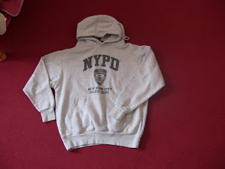 The irony of using this NYPD (New York Police Department) as well as the NYFD (New York Fire Department) (no picture attained) is highlighting on the major destruction that fire caused in the 2011 London riots and the arguable effectiveness of the police during these times. Obviously as they are NY departments it could highlight on the differences between the methods of the two places and there horror film representation.

We have used these shorts to represent voyeruism and male gaze in our trailer.
this makes the youth of the actor we are using even more apparent.
Here are some of the pieces and our ideas behind them:

The trainers we used have the colours purple black and grey in them: The black represents evil, the grey represents the transaction from good to evil and the purple highlights on the characters femininity.
The use of trainers also highlights on the age of characters we are trying to portray in terms of adolescent and the stereotypical view of adolescence in the twenty first centre.

- The use of this gilet represents youth in the form of fashions and trends that almost become obsession. Ideally I would have liked to have used a SuperDry Gilet but did not have the funds.
- Also the use of a hood to hide someones face is key to repressenting youth in a bad light. Certain groups of Youths are known as "Hoodies"

We have used these shorts to represent voyeruism and male gaze in our trailer.
this makes the youth of the actor we are using even more apparent.
 The use of a black T-shirt is to represent the loss of inoscence. Another element highlight youths and passing from childhood to adulthood. This method is used in Psycho.

Monday, 2 January 2012
inspirational movie magazine front covers

The shape of the buttons emphasize the feature also as they are not the typical shape they would be.


The main image has been cut away from the background and layered over the masthead to give it visual priority. This is also the case for the text along the side of the image.
inspirational movie posters


Subscribe to:
Comments (Atom)