Wednesday 4 January 2012

Props that we have used and why we have used them

During filming we used many items of clothing to represent our ideas subtly.
Here are some of the pieces and our ideas behind them:
 The trainers we used have the colours purple black and grey in them: The black represents evil, the grey represents the transaction from good to evil and the purple highlights on the characters femininity.
The use of trainers also highlights on the age of characters we are trying to portray in terms of adolescent and the stereotypical view of adolescence in the twenty first centre.
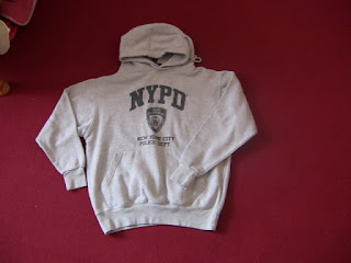
The irony of using this NYPD (New York Police Department) as well as the NYFD (New York Fire Department) (no picture attained) is highlighting on the major destruction that fire caused in the 2011 London riots and the arguable effectiveness of the police during these times. Obviously as they are NY departments it could highlight on the differences between the methods of the two places and there horror film representation.


  • The use of this gilet represents youth in the form of fashions and trends that almost become obsession. Ideally I would have liked to have used a SuperDry Gilet but did not have the funds.
  • Also the use of a hood to hide someones face is key to repressenting youth in a bad light. Certain groups of Youths are known as "Hoodies"


We have used these shorts to represent voyeruism and male gaze in our trailer.
this makes the youth of the actor we are using even more apparent.



  • The use of a black T-shirt is to represent the loss of inoscence. Another element highlight youths and passing from childhood to adulthood. This method is used in Psycho.

Monday 2 January 2012

inspirational movie magazine front covers

 I love the use of colour in this magazine cover. All of the colours emphasize the colours within the feature image making the magazine issue personal to the main film covered.
The shape of the buttons emphasize the feature also as they are not the typical shape they would be.
 This magazine cover features a masthead, a main image and one block of text (slightly different to a typical magazine cover). There is a colour theme of red white and black with yellow to emphasize the name of the film which is of main focus in this case Spider-Man.
The colour theme for text on this magazine cover is red, white and black. These colours are used to make the picture stand out and to put emphasis on some words over others.
The main image has been cut away from the background and layered over the masthead to give it visual priority. This is also the case for the text along the side of the image.

inspirational movie posters

 Tho most inspirational thing about this movie poster is the use of the effect which essentially blocks our side view. The effect appears to be a slash like marking created on top of the main image.
What I like most about this poster is the clear message it gives across. The colouring and damage to a famous land mark show disorder and a non-equilibrium state that New York city is under. I also like the simplicity of the image in terms of the little use of text. This would suggest that the image is left to speak for itself.
In this movie poster we are introduced the the "baddie". The disfigured state of the body highlights directly to the horror genre as it is one of its mane icons. another piece of iconography used in this poster is the knife (linking possibly to the slasher genre)